Wednesday, 30 March 2011
Evaluation Preperation
In preparation for our evaluation we equally divided the questions up using a variety of different media to answer each question. We want are evaluation to be informative but interesting and engaging at the same time therefore each question will be answered using three different media forms. As a group we decided that for one aspect of answering the questions we will record each of us talking then upload it to either Imovie or windows movie maker adding images and video clips to clearly convey what we are talking about. We will also use the online site Prezi to answer questions because it is a current and attractive way to display information. We will also stick to conventions we have already used which is blog entries. We will each upload our individual evaluation question onto our own blogs as well as posting all three member's of the group's evaluation the group blog. We are each talking about a specific text for each question. By doing this we will have a mixed review of answers. Then when all three answers to each question are put together on the group blog, all three texts will have been spoken about.
Monday, 28 March 2011
Trailer Progress - March 2010
Today we started to complete the editing for our trailer by trimming clips and filling gaps with various clips and captions in order to make the plot make sense and to make sure the audience understand clearly what is going on. We decided it was appropriate to delete the existing captions because they didn't fit in with the clips and didn't make sense. We then decided that we need to add some sort of a caption to the beginning of the clip because it didn't really have an opening and sent mixed messages to the audience because it didn't really give anything away which we thought would confuse the audience. We decided to open the trailer with a clip of two hands together to symbolize the love theme of the trailer as well as to introduce the audience to the plot. We then decided to add the tagline 'they thought nothing - would tear them apart' so that the audience could see that the trailer is about love and a relationship. We want the audience to sympathize with the characters, especially our main character 'Isa' played by Georgia White. By showing a "normal" clip of the characters it allows the audience to identify with the characters straight away. However the initial clip of the hands was too dark so the lighting and contrast had to be adjusted in order for it to be clear. Consequently the clip is now a little pixelated however this works in the favor of the trailer because it adds an 'eery' effect to the clip. We also decided to add the two captions in two separate screens because it symbolises the splitting apart of the two characters.
We then added a clip of 'Isa' dancing which allows the audience to see what she looks like rather than just her face which allows them to see that she is just a normal girl and identifiable. It also shows her being "normal". This clip was too long and we decided to trim the clip in order to keep the audiences focus. This scene is quite dark due to the lighting however we decided to keep this aspect to convey a real and believable party scene.
We then added a clip of 'Isa' dancing which allows the audience to see what she looks like rather than just her face which allows them to see that she is just a normal girl and identifiable. It also shows her being "normal". This clip was too long and we decided to trim the clip in order to keep the audiences focus. This scene is quite dark due to the lighting however we decided to keep this aspect to convey a real and believable party scene.
After this we decided to delete the scene of getting to the car and kept the crash and the driving of the car before this because we just wanted to show audience the key parts of the scene. The crash is a key part of the trailer because it explains how 'Isa' dies and the impact it has on the plot. A cross dissolve effect was used to move from the party scene to the crash crash in order to have a smooth transition and not to make it confusing.
Linzi then added in the captions 'love lasts forever - Nothing lasts forever' to add a twist to the film showing that it is not a "happy" film and has a dark side towards it. It also makes the audience question what is happening which is what we want because we want to add mystery to the trailer and do not want to give too much away otherwise there would not be any point in watching the film.
A grave scene is then included so the audience know that a death has occured. The clip following this is a clip of 'Isa' saying 'I thought you said you loved me'. We included this clip to show the juxtoposition between the love Isa had with her boyfriend at the beginning of the trailer to this particular point. Thiw will also make the reader question what is going on and why Isa contemplating whether her boyfriend loves her or not. In this clip, the character is looking directly at the camera at the beginning. We cut the beginning part out so that the rest of the clip shows her not staring at the camera.
The next section is the valentines card clip. We included this clip because it relates to the love theme as well as the release date which is valentines day - February 14th. We wanted the audience to clearly be able to see the words as they are sinister and shows the change from the love at the beginning to the more twisted situations. This clip was too quick so we made it longer in order for the audience to be able to read it in enough time.
We then added clips of a forest area and the main characters hand 'creeping'. We did this to keep to conventions of existing horror films and also conveying to the audience that someone not quite right has occured. We made the clips extremley short in order to have a 'quick' and 'flashy' effect. These types of effects are often used in horror films in order to keep the audience in suspense. This is key because the aim is to make the audience scared and this effect does that. We also added these clips to make the trailer longer because we felt it was too short and didn't explore the plot well enough as well as making the storyline clear to the audience.
Then, a clip of Isa running was added to show a sense of mystery as well as getting the readers wondering who she is running away room or what she is running away from. This is followed by clips we have already used in the trailer but rewinded them and used the captain 'What would you change if you could reverse time?'. The point of adding these clips was to make the audience question why the characters would want to reverse time.
We added credits in order to keep to the conventions of existing trailers. The caption 'Love just got scary' followed and was added to the end of the trailer because it is the tagline for our film. We decided to have the text on a red background because it is bright and eye catching and will instantly catch the audiences attention. The significance of using the colour red is not only to attract the audience but to symbolize the love and danger that is featured in the film.
The last part of the trailer so far is of Isa with her face right up to the camera. This has been added in order to scare the audience after the initial trailer has been displayed. At the moment this clip is in silence. Originally it had music but we felt as group this didn't work and didn't make the clip shock the audience which is the aim. We discussed what we thought the clip should sound like and didn't think silence would be appropriate because it didn't have the 'shock factor' we want. We decided on a 'growl' noise although this has not been added to the trailer yet. This will be further development as this will be added.
We are happy with the current sound effects in the trailer because the music is quite tense which is the type of music a horror film usually has. We are keeping to the conventions of existing horror films in this respect as well as using this type of music to worry the audience. We also used a car crash sound which I think is really effective because it has an impact on the trailer and changes the mood dramatically. Further developments to the trailer will to be to add the 'growl' sound as well as adding in any additional clips and captions to make the trailer run as smoothly as possible whilst conveying the message and plot of the film without spoiling anything.
Promotion
To promote our film we have created merchandise such as t-shirts. We did this so that we could promote the film to a variety of people in different ways. We hoped that this would appeal to a variety of audiences.

We also used the film's twitter page as promotion www.twitter.com/myvalentinefilm
We decided to create a twitter page because social networking is something that our target audience use regularly. It will allow our target audience to be able to find out about the film in a way that they enjoy as well as making it easy for other people to see even if they didn't intend to.
Magazine Progress
This is our magazine so far. Obviously it is not yet completed but this is the design so far. Linzi and Georgia focused on the magazine whilst I worked on the film poster. We decided to name the magazine 'Roxy' because it is current and 'savvy' and we felt as if this would attract our target audience because it is similar to existing magazines and does not seem out of the ordinary. We had previously decided as a group that we are going to have two front covers that work as a 'pull-out' cover. One side will be 'girly' and 'normal' which represents Georgia's character, 'Isa' at the beginning of the trailer. We based the first cover on existing magazines such as 'Cosmopolitan' and 'Company'. We wanted to keep to the conventions of existing magazines in order to make it look professional and believable. Bright shapes and taglines were added as well as bold text and eye catching colours in order to entice the audience. The 'dark' magazine cover was created to look more 'edgy' and 'dark'. We based this cover on the magazine 'Empire' because 'Empire' magazine seems to have done similar covers. We wanted to make both sides similar but the 'dark' cover more sinister and scary. We decided to have this additional cover as well as the first one in order to attract and wider audience and to not just attract 'girly girls'. We want the trailer to appeal to all types of people and both genders therefore the second cover hopefully appeals to those that the first cover does not.

The first cover's title is 'floaty' and 'friendly' in order to convey the 'good' side of Isa. The second cover uses the font 'Friday13' which is the same font used on the film poster. This keeps to the conventions as we are keeping a constant theme. This will help the audience to easily be able to identify that the poster and the magazine cover are promoting the same film.
We also decided to add a heart at the side of each cover and when you pull out the cover the heart will connect. We decided to add this in to symbolize the love and show that it wasn't always 'connected' in the film. We decided that each half of the heart would be a different colour. The 'good' side is a light pink in order to show that it is the 'good' side. The 'evil' side's heart is a deep red in order to display a more 'sinister' and 'twisted' side.
We have not yet added the photographs that will feature on the front of the covers however I have edited some images that I have posted in a previous blog entry. The first image which will be on the 'good' side is a 'happy' and 'smiley' image of Isa (the main character of the film) to keep to the conventions of being 'good'. The second cover will feature a 'twisted' image of Isa looking scary. I edited an image on Photoshop using a diffuse glow effect in order to change the image from "normal". I also used a diffuse glow effect on the image used on the poster which will keep a constant theme going. I also decreased the lighting in order to make the image appear 'scary'. However, the images did not look right once placed on the cover. Therefore we will have to manipulate them on Photoshop or take new images.
This is currently our cover/s;


This is an existing magazine cover of 'V' that was used for inspiration for our work;
British Heart Foundation
In our group we decided to coincide our film with the British Heart Foundation. We decided to include a charity to show that our film is not all about scaring people, it also benefits a charity. We decided that profits from our film would go towards the British Heart foundation. We picked this specific charity because the 'heat' relates to 'love' which is the main theme of our trailer. We believe that linking the film to a good cause will benefit the film as well as the charity.


Friday, 25 March 2011
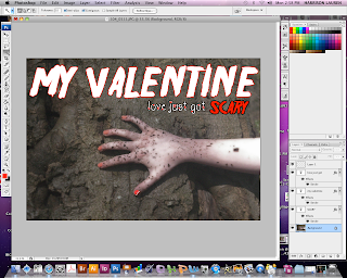
Final Poster

This is our final film poster.
I worked on the poster whilst Georgia and Linzi focused on the magazine cover. Originally the title was in the font 'TX_love' that has now been used for the words 'love just got'. We decided to change the font to 'Friday13' which was originally intended for the tagline because we felt this conveyed a horror genre more than 'TX_love'. We felt that "TX_love' was to "friendly" for a horror film and made it look as if the film was a romantic comedy. Also, the title was white but we felt as if this wasn't scary enough for a horror trailer as well as not standing out and fitting in with the conventions of the poster. When working on the poster I decided to change the title colour to black. I was going to change it to red because red connotes danger and blood but decided that would be to obvious for the title and instead I used this on the word 'scary' because we wanted to emphasize that particular word. We decided on the colour black because black is associated with power, death and evil which is a key part of the film. The main character is powerful because she has a hold on her former boyfriend. However we decided on a red outline in order to convey the sense of danger and to help the title stand out.We decided to keep 'the TX_love' font in the poster because it related to the love aspect of the film as well as linking to the film's release date which is February 14th - Valentines day. We used it on 'love just got'. However we decided to change the font to 'Friday13' when it got to the word 'scary' to add the sense of horror. We decided for these pieces of text to be in two separate colours in order to show the juxtaposition between the 'love' and 'death' of the storyline.
I included the British Heart Foundation logo on the poster because as a group we decided that our film will benefit the British Heart Foundation. We decided that profits of ticket sales for the film would go to the British Heart Foundation. We decided on this particular charity to coincide with our film because it relates to the 'love' theme of our film and at the same time, gives recognition to the charity.
With the image used for the poster, I used a diffuse glow effect on Photoshop in order to add an 'eery' effect to the poster and to make it less 'normal'. Also, I used adjusted the brightness, lighting and contrast as the photo was too light to begin with. Audiences associate dark lighting with being 'creepy' therefore this was an essential aspect of the poster. We decided to use this specific image because it is stereotypical for a horror film and is obviously creepy. As well as the obvious aspects it is mysterious. We haven't shown the face of the person who's hand it is. It is in fact the main character's hand, Isa (played by Georgia White) but the audience don't know this which adds a sense of mystery. This is an aspect that could attract people to watching the film because they are intrigued as to who the hand belongs to and what the significance is.
I decided to make the date of the film's release a different colour to the rest of the date because it is the most important part of the sentence as well as linking to the title and aspect of love and death.
On the poster, star ratings were also included as it keeps to the conventions of existing film posters I have researched. I decided for the star rating to be from 'The Times' newspaper as it is highly recognized and well known. If the audience see that 'The Times' recommended the film it would be highly likely for the audience to want to see the film because they trust the judgement from 'The Times'.
Monday, 21 March 2011
Poster designing
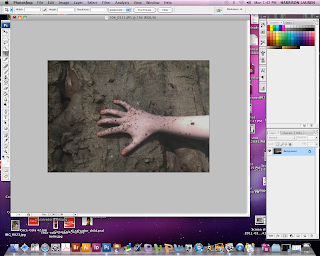
On photoshop I have began to start editing the final image for the poster. After previous audience feedback, we decided on the photograph of the hand on the tree. As a group, we took another selection of images so we had more to choose from. However the lighting was extremely bright which didn't stick the conventions of being 'scary'. On photoshop I will change the lighting and contrast to make it 'creepy'.
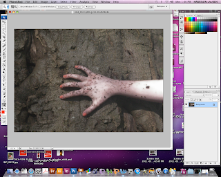
On Photoshop I have adjusted the contrast and brightness in order to make the image look darker. I also changed the hue and saturation so that the hand doesn't look 'normal'. I also used a diffuse glow option in the filter gallery because it adds an 'eery' effect to the image. Also, I used this effect on the front cover image of our main character for our magazine. This will link the two together and keep to set conventions. In our audience research the fonts were decided for our poster. The two fonts were 'friday13' and 'TX_love'. When designing the poster, we decided as a group that the 'TX_love' font was too colliqual and didn't fit the conventions of a poster. We decided on using 'friday13' for the title opposed to the tagline because it was a more scary font and stuck to the conventions of a horror film. However we still wanted to use the 'TX_love' font because it conveys the 'love' in our film. The 'love' in the film is one of the key concepts so we needed this to be evident in the poster.
When editing I made the title white because I thought it stood out and wasn't to obvious as red would be. However when developing the poster further we decided that white didn't really work so changed it to black because it is bold. However, I added a red outline in order to make it stand out.
Thursday, 17 March 2011
Film Poster
My group is in the final stages of designing with the magazine cover and poster. I am going to be working on the poster. After getting feedback from my other class members we know what type of image will reach the target audience as well as the text type and colour scheme. I have researched some posters which are similar to the ones that I will try and recreate so that it is clear what I am trying to achieve. I will us photoshop to create the poster because it has great effects which work really well such as the brightness and contrast tool which helps to make the selected image more 'ery' looking which is what we want to convey to the audience. The final image that has been decided is the image of the main characters hand. This will be used as a background with the text layered on top. In the second poster the text is surrounded by a red tint. This conveys the horror aspect because red connotes danger and blood which automatically shows the audience that the film is of the horror genre. I will try and include this on our groups poster in order to keep to the conventions of horror trailers as well as let the audience know the type of genre in a subtle way.


This is the look of poster we are going for. We don't want to give too much away but we want it to be mysterious and obviously scary. We want the audience to automatically be able to identify what genre film it is from the first look. We used the idea of the hand in our poster because it adds a sense of mystery and makes the audience what to know whos hand it is, what the story is ect. We think it is a good idea to add mystery to the poster so that when the audience go to the cinema to watch the film they are already intrigued and worried therefore they already have a sense of fear which the film will hopefully build.
Monday, 14 March 2011
Original Images
For the poster we decided to use an image of the main character's arm creeping across a tree. We decided upon this image as it was an effective part of filming that we had done when filming our trailer. We conducting research for the poster we used a screen shot clip of the hand on the tree just to test out what it looked like an if it worked well. After receiving audience feedback which was positive on this idea we decided it worked well and went ahead with the idea. We went back to the area that this particular clip was shot and re-took photos so that we could use a clear image. We also took the photograph in different positions such as going horizontal and diagonal as well as having the hand still in one shot and 'crawling' in another. We decided on the third image above as the final image because we thought that it conveyed the message we are trying to portray to the audience which is someone subtly creeping back into the life of her former boyfriend.


Trailer developments
We decided in our group that we are going to use flashing captions saying 'Love lasts forever' which evolves into 'nothing lasts forever'. We decided on this because we saw it on an existing trailer we viewed in class and thought it looked effective and worked well. I took screenshots of an example that I made to try and show what we aim to produce. We saw this effect in an existing trailer and thought it was effected because it adds mystery and makes the reader question what will happen.


This however didn't work out on Imovie as we couldn't create the effect we aimed for. We then decided to add to separate captions instead. We decided to convert this to two separate captions in order to symbolize the divide between love and death in the trailer.
Development ideas for the magazine cover...


Last lesson, my group decided to make a 'mock' magazine cover to try and convey our thoughts. It is difficult to explain exactly what we were aiming for, so by creating a hand made version of the cover we were able to show what we hope to achieve. We left blank the places that the images of the main character would go. My group also included captions that would feature on the front cover of the magazine. These included '5 Top valentines gifts' which convey the 'valentines' theme that we want. It also relates to the target audience because it is quite 'chatty' and 'colloquial' which will fit the age range we hope to attract. We decided that we wanted the magazine to be a pull out magazine consisting of a 'good' cover and an 'evil' cover. The 'good' cover links to the main character of the film, Isa and how she was at the beginning of the film which is 'normal' and 'good'. However the second cover will be 'twisted' and 'dark' in order to convey how Isa is as the film progresses. This will symbolize Isa's significant change and how she has gone from good to bad. We also decided on having half a heart on each front cover and when you pull out the second cover the hearts will connect. We want the 'good' cover to look like a 'normal' teen magazine like 'Company' and 'Cosmopolitan' so that it will reach our target audience as well as convey the 'good' side. We wanted to base the 'evil' cover on magazines such as 'Empire and 'V'.
Monday, 7 March 2011
Magazine Ideas
Today I edited the image that we are going to use on the front cover of our magazine. I took an image of the main character. For the magazine cover we wanted to portray a 'creepy' feel so that the readers would clearly be able to identify the genre of the film. I also made sure that the character in the photograph was making eye contact with the camera so that she connects with the readers. It will make it look like she is staring directly at the readers. I changed the contrast and used a distorted look from the filter gallery on photoshop. I did this to make the photo look scarier than the original. I did not change the red eyes because I wanted the photos to have red eyes in order to convey the 'horror' feel to the audience. I also think that making the character's skin paler also helps to convey the horror genre as well as help convey the message that this is the 'scary' character from the film. It also implies she isn't 'normal' - showing that she may have died or is possessed.


Also these are the original images of the 'good' and 'bad' theme we wanted to include in the magazine. This are the images we want to use for the pull out I have mentioned in a previous blog. One image will be a 'normal' looking photograph and then the pull out image will be a 'possessed' image'.

Subscribe to:
Posts (Atom)