On Photoshop I have adjusted the contrast and brightness in order to make the image look darker. I also changed the hue and saturation so that the hand doesn't look 'normal'. I also used a diffuse glow option in the filter gallery because it adds an 'eery' effect to the image. Also, I used this effect on the front cover image of our main character for our magazine. This will link the two together and keep to set conventions. In our audience research the fonts were decided for our poster. The two fonts were 'friday13' and 'TX_love'. When designing the poster, we decided as a group that the 'TX_love' font was too colliqual and didn't fit the conventions of a poster. We decided on using 'friday13' for the title opposed to the tagline because it was a more scary font and stuck to the conventions of a horror film. However we still wanted to use the 'TX_love' font because it conveys the 'love' in our film. The 'love' in the film is one of the key concepts so we needed this to be evident in the poster.
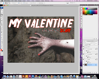
When editing I made the title white because I thought it stood out and wasn't to obvious as red would be. However when developing the poster further we decided that white didn't really work so changed it to black because it is bold. However, I added a red outline in order to make it stand out.
No comments:
Post a Comment