Monday 13 December 2010

Storyboard


This is just a rough storyboard of our initial plot.
1- The main two characters are at a party. They go together, with the main character (girl)'s boyfriend driving. They both drink alcohol at the party.

2 - The boyfriend drives home reassuring Georgia's character it will be ok even though he is aware he has had too much to drink. They are involved in a serious car crash.

3 - We learn that our main character has been killed in the accident leaving her boyfriend distraught and reeled with guilt. He knows it is his fault and still loved her.

4 - He is struggling to deal with her death as he knows he caused it.

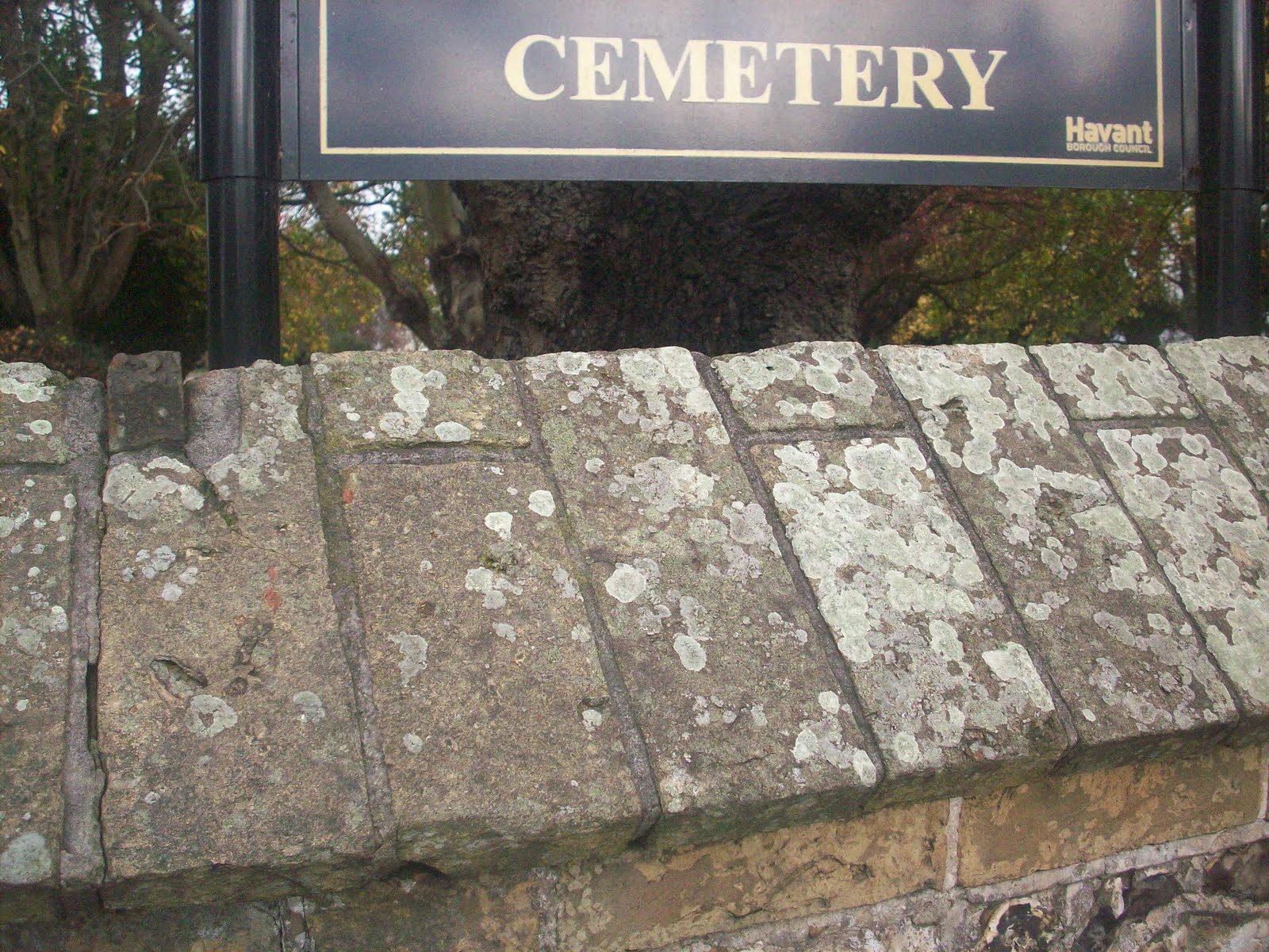
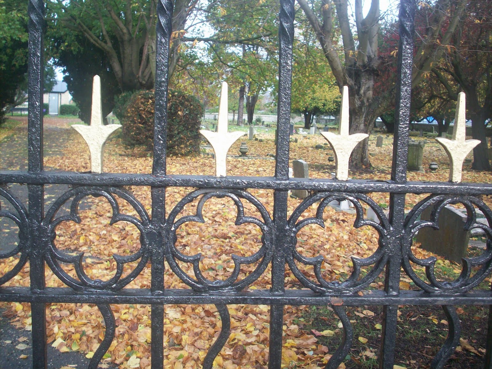
5 - After going to is dead girlfriends graveside to try and feel closer to her he is astionished to find her standing near him in the graveyard. Is it really her? Is it a spirit? Is it his imagination?

6 - The main character continues to 'haunt' and cause chaos to her former boyfriend. It is believed she wants revenge for her death although she still loves him.

7 - He is unsure whether it is a ghost or his imagination. Things start to feel unusual and creepy and he is now starting to wonder if she even existed. Is his mind playing tricks on him? Is the spirit playing tricks on him?

8 - His dead girlfriend continues to terrorise him until it reaches a shocking end.

Exploration of texts for film poster

I have previously uploaded some fonts that were potential fonts for our film trailer poster before we knew the name of our trailer. Now we have come up with a name (My Valentine), I explored a variety of fonts which I thought worked with the name as well as fitted with the genre. I plan to print out these fonts and ask some people which font they prefer so that we as a group get a clear idea of what works, not only for our trailer but for the audience too. In our group we discussed the type of font we would like to use. For 'My Valentine' we want quite a subtle, 'nice' font so that a 'love' feel is conveyed. Then we want the text 'Love Just Got Scary' (which is the tag line) in a 'scary' font because that is the part of text that we want to appear daunting and show the audience the genre of film.

Poster Ideas

I have been experimenting with different photographs we took for the films poster. This is not our actual design. It is just part of research. I think the picture in this mock poster is good because it is creepy and portrays the type of feel we are trying to show but I think the colouring and the text are weak points and is something that needs to be researched more to make sure when the final poster is created, it is much more scary and 'sharp'. I experimented with a red colour because red connotes blood and danger and this will convey this type of feel to the audience which is the type of feeling we want to convey. The text needs to be 'spookier' and 'bolder'. We need the text to 'jump out' at the audience. I think for our final design, we will incorporate a picture of a hand which is similar to this. I think this idea is effective because it is scary and the audience will be asking questions. Who does the hand belong to? Why is it there? Are they alive? Are they dead? We will need to carry out research such as asking other people which fonts are effective and would stand out.

Monday 29 November 2010

Trailer Making

I have been doing some filming seperate from the group so that we all have a chance to film different locations to make our trailer more exciting. I put together a small clip just to show what type of feel trailer we are going for and the things I have been filming. I didn't want to make it too long because it was just a test to see if the clips conveyed the right message and worked well together.


In class, Linzi and myself started to put together our clips to create the beginning of the trailer. We still have a lot more to edit onto the trailer but below is the beginning of our trailer to show our progress so far. We researched a variety of different sounds on websites such as youtube so that we could find one that we thought fitted with the theme and style of our trailer. We picked a car crash sound that had the sounds leading up to the crash, the crash and the after effects of the crash. We don't attend to use the full clip but we want to use parts of it so that the it just 'teases' the audience and doesn't tell the whole story.


this is the sound effect we used in our clip;

Monday 8 November 2010

Photoshop

On photoshop, I took some of my images from the graveyard and edited them to make themmore appropriate to fit the style of the trailer. Originally the images are quite light because they were taken late morning. Photoshop has helped to enhance the shadows and make the location look darker and later in the day than it actually was taken. I wanted to add a dark and edgy feel to the location so it looked scary and fitted the horror genre. If it was bright, sunny picture it would not fit the genre and not work well. Also, the graves make it creepy and create a backdrop to the story. The graveyard also fits in with our story as one of the characters in the trailer dies.


hh

Horror Trailer Preparation


After discussing with my group what kind of location we wanted to use for our trailer I went out independently and took some photos of my selected location. I decided on a graveyard area because it has that automatic spooky feel to it. Although I took my pictures in daylight (whereas ultimately our group would like our locations to be filmed when it is dark), I think my photographs give you a clear idea of the type of 'feel' we are going towards. I wanted to convey quite an ery feel as well as quite secluded and empty so that the audience will automatically get right type of vibe - which is creepy. I also wanted to take photos/video clips of an area which would make the audience scared and make them question 'is something/someone going to appear?' 'whats going to happen' ect.


Monday 1 November 2010

More Location Ideas


As a group we have selected 'The Royal Garrison Church' in Portsmouth as one of our particular locations for our trailer. We have considered this particular location because we think it has quite a 'spooky' vibe. A member of my group (Linzi Moxham) has gone to the location to take photos which can be seen on her blog. For futher development we are going to visit the location again but in the evening so that is more "creepy" opposed to a photo taken in daylight. Also we are going to film at the location too.

Friday 29 October 2010

Mind Map Ideas


As part of my research I did a mindmap on basic ideas so that I have a collection of my orginal ideas. This is helpful as I can pick certain ideas to test out when filming.

Thursday 28 October 2010

Futher Ideas

As mentioned on a member of my groups blog (Linzi Moxham), our group have been researching locations for our horror film trailer and have focused on a church in our local area (The Royal Garrison Church). We plan to go to the location and take photos for futher research to make sure the area is suitable for a horror film and it will also give us a better idea of the trailer will pan out. My group have also seperatley taken photographs of certain areas that we think fit the horror genre and as possible location. I went out and look photographs of 'ery' areas such as a lake, ally way and forest. Other members of my group took photographs of things such as a caravan at night and bridges. As a group we have discussed our locations and all favour the church so far. We will decide on a final location soon and once the final location/locations has been decided we will start filming in the area. Before filming the actual trailer, we will film test shots to get a clear idea of which areas we will film in, which is the best camera angle ect.

Also, my group went to a forest area by our college just to test out different camera techinques such as hand held shots and filming whilst the camera is on a tripod. We tried both techinques out to see which one was most effective. We decieded they both worked will in different ways and may use both techinques when filming our trailer.

Here is our practice clip;

Thursday 14 October 2010

'Horror' Title Research

As a group, we have not decided on a final name for our Horror film yet, so when researching potential fonts for our title I used the word 'Horror'. I researched many fonts using the website picnik.com to see which ones I thought suited the genre. I stuck with a simple black colour for the time being so that you can focus on the font type rather than the colour at this stage. For a horror film, I think bold fonts would probably be better because it suits the genre as horror films stand out like bold text does. They are 'brutal'. I think 'thin' fonts give the wrong impression to the type of film trailer I aim to produce. I want my groups title to be obvious to the audience on what genre film it is.


Monday 4 October 2010

Developing Ideas for the horror film trailer.

As a group we decided on the paranormal genre for a horror film. We researched film trailers on youtube that fitted the paranormal genre. On our joint group , we analyzed the trailer for 'Paranormal Activity'. We carefully looked at the techniques used and the footage that was used. It helped identify what worked in the trailer and what didn't. It also collectivley helped us see what features and types of clips we should use in our trailer. The 'Paranormal Activity' trailer also had critical acclaim in the trailer - this was one point that we had not thought about yet. This is now something we have to consider. Individually, we all looked at a trailer ourselves. I picked 'The Exorcist'. Underneath the trailer is a detailed analysis of this trailer.


At the beginning of the trailer the audience are shown nothing - just a black screen whilst tense music plays. This has been done to give a sense of mystery and 'lure' the audience in and make them question in their minds whats going to happen. It also keeps the audience 'in the dark' about what is going on which is how the characters in the film will feel as they won't know what is going on either. The tense music also gives the audience a clear indication automatically on the genre of the film which I think is really important. If you don't know the type of trailer you are watching at the beginning then I don't think the trailer has worked very well.

We, as the audience are not introduced to a character until 12 seconds into the clip. When we are, dark lighting is used to create the 'ery' and 'spooky' effect to make us on the edge of our seats. Also when the character is finally shown, we are shown a low angle view. This has been done so that we are wary of the character but are also on the 'journey' with him to but as if we are watching him rather than with him.

A stern voiceover is also used in the clip to distance itself from the characters but still let the audience know what is happening. A stern, authoritive tone is used so the audience don't feel comfortable or so it is predictible.

Dark lighting is a common theme for horror movies and has been used in this trailer. Darkness makes you feel umfortable, scared and 'on edge' and by using this effect it makes the characters and the audience feel this way.

The sound effects used in this trailer include tense music, screaming, yelping, slamming doors, footsteps running up the stairs ect. I think the most effect would be the tense music as it is an automatic effect which scares the audience as they know something is about to happen. I also think footsteps of a 'relatable character' are effective to because it portrays to the audience her fear and worry.

When a scary 'creature' is shown at 0:42, the face is not shown. The audience are just shown quite a distant view surronded in shadows and dark lighting to show mystery and show that the audience are not automatically going to be introduced to the 'scary creature', it will remain a mystery and we will have to go on a journey with the characters to find out who/what it is.

An over the shoulder shot has been used to make us feel 'included' in the story and and as if we were part of finding out the mysteries. This makes the audience feel 'closer' to the characters and 'involved'.

Other techinques that I think work well include the quick editing which gives the audience a sense of intensity and so they are abe to 'step into the shoes' of the characters and get a sense of how they are feeling and how scary it is.

Monday 27 September 2010

Horror Film Ideas

After discussing with my group, we thought of different ideas of plots for our film. One idea was for the film to be set on halloween with trick or treaters knocking on various doors wanting excitement and to be scared. They actually get more than what they expected and after knocking on a eery looking caravan they are pulled in ... but nothing pulled them in. The film would centre around them trick or treating then finding the caravan and following the struggles to survive. This follows the conventions of existing horror films as it has mystery as the audience will have to wait until the end of the film to find out what is terrorizing the characters which is a common factor of existing films.

Another idea my group thought of was to centre around the caravan I mentioned in the first idea. We chose the caravan as a possible location because it takes something simple and adds mystery to it and it is also not obvious. We have used the 'haunted house' idea but developed it to a caravan. We thought one of the main characters could arrange a halloween party, as we would like our film to be based on Halloween as it is quite scary in itself as it is the night for people to dress up as scary characters. Ideas for the main points in the film could be the characters trapped in the caravan with something chasing and terrorizing them. It could be a real person or it could be something supernatural. These are still ideas. Possible endings could be all the characters to die. Another one could be all but one character could survive which would be a good aspect to stem a sequel on.

Research of trailers

When researching existing horror film trailers I came across the trailer for the 2010 film 'Let me in'. I used this trailer to take ideas, inspiration and identify common themes of horror film trailers to help me with my work.


A common theme which has been used in this trailer is the use of close ups. It has been used to make things intense and to make the audience feel uncomfortable. It also introduces the audience to the characters which makes the audience feel closer to them.

Another common theme I have picked up on is the use of tense music at the beginning of the clip. This techinque has been used in other horror film trailers I have looked at such as 'the exorist'. This introduces the audience to the genre of the film straight away and makes them question 'what is going to happen?' 'what is going to appear?' 'will something jump out?'. It instantly makes the audience scared and worried which is the point.

Quick paced editing has been used to show the intesity of the action and to give them an idea of the characters thought process.It will make the audience feel as if they are experiencing what the characters are too. It also makes the events seem 'scarier' than they actually are.

Things such as a dark tunnel has been shown because it looks creepy and it is obvious something is going to happen. It brings a sense of mystery and makes the audience question what will happen next.

Sound effects such as whispering have been used because it also makes it mysterious and it will make the audience feel 'on edge' because it is quite scary.

Another aspect which I have noticed has been used in other horror film trailers is the use of a blank black screen. This makes the trailer scarier because you can only hear not see. It makes the audience unsure and scared and this is how the characters are likely to be feeling too. The characters in the film will be filled with confusion and by showing the audience a blank screen it portrays these feelings to the audience too so we will be feeling the same as the characters. It makes the audience feel 'in the dark' like the characters. It also signals to the audience that something will happen soon.

Research - Existing Horror Films


I researched stills from existing films to see the type of conventions they follow so that I can use aspects of them in my groups film. In this particular still which is from 'Nightmare on Elm Street', it shows a close up of the films main character, the one that all the characters in the film are afraid of. Close ups of the character are used a lot in the film to make the audience feel scared and feel the same kind of emotions that the rest of the characters in the film feel towards the character. Also, the dark shadows which does not allow the audience to see the face of the character clearly is often used in horror films to create fear and mystery to the character which helps to build a sense of worry and fear amongst the audience.


Research

After discussing with my group, we decided to take pictures of various locations that we thought suited the 'horror' genre. We seperatley went out and took photos of places that we thought fitted the brief.We have to decide which type of theme which is either supernatural, the scientific and the naturalistic that we are going to choose. I decided on various locations near my home such as a forest, graveyard and bridge/walkway. We also took into account what type of locations are used in existing horror films by watching trailers and looking at image stills from films so that we make sure our locations fit the genre correctly.


I took this picture of some water because it is quite a peaceful setting. Frequently in horror films (but not all horror films), some settings used within the film are quite 'normal', especially in daylight so that the audience get a sense of normality and are able to relate before everything goes 'scary'. It is usually as the day progresses or when it gets dark that the setting would appear 'ery' and make the audience expect something to happen. As our intital plot has not been completley developed yet I am unsure if this setting would be suitable but I definatley think it has potential to be horror film setting. As initial research, I am going to hopefully go back to the location to take a photograph at night so it is easier to picture how 'scary' and 'frightening' the setting will look at night.


For research, I took a picture of this allyway because it is secluded, dark and 'cut off' from the rest of the area. I think this would be a great setting for a horror film because the sterotypical view of an allway is that it is scary and people creep up behind you. Especially in the dark, the allway would spark questions in the minds of the audience because they would want to know 'whats going to happen' 'whos going to come in the allway' ect.


I took this photograph at night of river type area. I took this photograph before we had fully developed our ideas but I thought it was appropriate for a horror film because It has an 'eery' vibe. I thought it fitted the conventions of a horror film because first of all, water such as rivers or lakes can be seen to be quite scary and mysterious because for all the audience knows, that could be the background to the story. There could be a mysterious creature living under the water. Secondly, I thought this picture was appropriate because the area is quite small which makes it more frightening because the 'scary creature' would be nearer to the 'victims'.


I took these photographs of a forest area because 'woods' are stereotypical horror film locations. For the first image, I was going to do a low angle shot to display the area from a different point of view but then I just took the photo looking directly at the trees just to show what the location looked like and if it was relevant. Also in this type of area the lighting is dark and there are usually a lot of shadows which will help to make the area look ery and fit the film genre.

Monday 20 September 2010

Pre-Production: Trailers

What is a trailer?
A trailer is a small preview which is usually no longer than 2 and a half minutes, using various clips from the film to attract an audience and to make the audience want to see the film. Usually trailers use some of the most exciting parts of the film such as big action moments or funny moments but nothing that spoils the film. A trailer plays a huge part in promoting a film because if a trailer doesn't interest audiences then not many people would want to see the film. Also, if well known stars are in the film or are guest starring in the film, they will be shown in the trailer so that their fans will want to see the film.


Where might a trailer be seen? How will different formats affect the viewing of the trailer?
A trailer may be seen in the cinema before the film that the audience have come to see is shown. This is a good opportunity to attract the audience to see the film as the trailer will be of a similar genre to the film that the audience have come to see. Also trailers are shown on television in advert breaks which will attract a wide range of people because it doesn't really target one specific age range when shown in advert breaks other than the fact that (for example) horror film trailers will more than likely to be shown at a later time as it is not appropriate for children. Trailers may also be seen on the internet on sites such as youtube and facebook. Different formats affect the viewing of the trailer because trailers viewed on the internet will be more likely to have a younger audience opposed to trailers shown on television.

What are genre conventions?
A genre convention is something used in a specific genre that the audience will easily be able to identify which tells them which genre film it is. For example; if the audience see tense music, dark lighting, blood, dead bodies or something similar they are likely to assiosate that with the 'horror' or 'thriller' genre. Another example is in 'superhero' films, the superhero will wear a costume and in 'action' films the audience would identify aspects such as guns, chasing and fast editing. Films such as 'romantic comedies' have traits such predictable storylines and 'happy go lucky' characters.


Trailers

Trailer #1 - Nightmare on Elm Street.


Events Raised & Questions that could be asked;
1- Man walks into diner - Who is he? Why is he there? Why him?
2 - Hand/Claw appears - Whos is it?
3 - Freddy Kruger attemps to attack people with his hand - Why is he after them? Why does he have a claw? Who is he? Why those particular people?
4 - Freddy states 'remember me?' - Where should he be remembered from?

Trailer #2 - Prom Night


Events Raised & Questions that could be asked;
1- A blonde girl is introudced - Who is she? Is she the victim?
2 - The lights switch off - Why? Who did it? Whats the motif?
3 - A shadow is shown - Whos is it? Why is he/she there? Are they the victim? Are they the 'evil' person
4 - A dead body is pulled away in a bodybag - Whos is it? Who did it? Whats the motif?
5 - Girl is hiding under the bed crying - Why? What has upset her? What is she hiding from? What is she witnessing?

Trailer #3 - Dread


Events Raised & Questions that could be asked;
1 - A person is dragged down the stairs - Who is it? Who dragged him/her?
2 - Someone is holding an axe - Whos is it? Why have they got it? Who do they plan to use it on?
3 - A little boy is introduced - Who is he? Why is he there?
4 - A man is killing people - What is his motive? Who is he killing?
5 - Girl volunteers to be questioned - Why did she volunteer?


Which of the trailers give a strong narrative of the film?
I think the first trailer "Nightmare on Elm Street" gives a clear, strong narrative of the film due to the fact that it is clear to the audience what the story is about. The close ups of 'Freddy Kruger' show the audience who the 'villian' of the film is. Also the fast paced editing, dark lighting and aspects which make the audience jump help make the audience realise what genre film trailer this is almost instantly. I also think that Freddy Kruger saying "remember me" cleary indicates to the audience that the characters have some sort of history with him which is a postive aspect because it will make the audience want to find out how? why? ect.

Which of the trailers do not give a strong narrative of the film
I think the trailer for 'Prom Night' is not extremly clear on the narrative on the film. It is obvious to the audience that the film is about a prom night gone wrong but the audience aren't cleary told/shown why. I know that the aim of a trailer is to interest the audience and persuade them to want to see the film without spoiling the plot but the audience do need a clear insight on the film which I don't think this trailer does enough. The fast paced editing seems to work against the film in this particular trailer as it comes across as confusing to the audience rather than scary in my opinon.

What is the difference between a full length trailer and a teaser trailer?
A teaser trailer is a small preview of a film to give you an insight into what the film is about which is usually between 30-60 seconds. However a full length trailer lets you know in more detail what the film is about and the general plot which usually a couple of minutes long. Teaser trailers are usually released around a year before the film is due to be released wheras full length trailers are released nearer the release of the actual film. A teaser trailer is to 'tempt' the audience to see the movie and be interested in and the full length trailer can be seen as the 'reminder'.

Movie Posters


In this poster, and the two other posters I have looked have a constant theme of not showing the main 'attraction' in the posters face. In this particular poster, Freddy Kruger's face is looking down so the audience are unable to see a full frontal view of his face. This is suitable to the horror genre as it adds a sense of mystery which will intrigue and hopefully scare the audience.

Also red has been used for the films title, the release date and some parts of Freddy Kruger such as his collar and sleeves. This has been used because red connotes aspects such as danger and blood. This relates to the horror genre because danger and blood are usually common themes within a horror film. I think using colours that connate themes within the film is good idea because it sends the right impression to the audience. If the title was for example, bright pink you wouldn't necessarily think of a horror film straight away.

The font used for the title 'Nightmare On Elm Street' is bold and rigid. It displays to the audience that it is not a 'fun' film - it is 'bold' and frightening. This also conveys a sense of seriousness, opposed to 'chick flick' type films. In my work I will use fonts like this so the audience can automatically see what type of film it is.

Other than red, the colours, shadows and shades in the poster are dark. This adds an eery vibe to the poster and displays the right kind of message to the audience this type of film is aimed at which is teenagers and young adults. This is a constant theme within horror film posters as you don't usually see bright colored horror film posters.


As well as the poster above, the poster for the film 'Prom Night' also does not give you a clear view of the person in the poster's face. This is done to tease the audience by giving them a sense of what to expect without revealing the 'baddie' or spoiling the film. This is something I will use in my groups work because I think it is a technique that is appropriate and works well with this type of film. It is a technique that makes the audience intrigued to find out what happens and how the story will pan out. Also, the person in the poster making a 'screaming face' also adds to the mystery and thrill of horror films which is intended to scare the audience.

Proving that it is a common theme, the title of 'Prom Night' is also in red. This has been done to convey a sense of fright and panic automatically to the audience. With posters, the audience need to be attracted. As well as conveying danger, red is also bright and eye catching which likely to attract attention.

The font of the title of 'Prom Night' is also bold and in capitals to show to the audience that the film is striking and alarming. It is not 'playful', it has a seriousness to it.

Aside from the title, the rest of the poster has a black and white theme to it. This is a feature that I'm considering using in my work because dark contrasts and tones automatically portray some sort of fear and mystery.


Keeping with the theme of not showing the 'main attractions' face, this poster also hides the face of the main person on the poster. Differing to the two previous posters I have analyzed, this poster is not a close up it is distanced. I think this is more effective because it doesn't straight away introduce you to the character it adds more secretiveness to the plot and makes the audience feel like there is lots to know and find out.

Also differing to the previous two posters, the title 'Dread' is in black not red. I think this is effective because it is not copying other posters and keeping to the same theme but it still portraying a sense negativity such as fear and death without going for the obvious choice of red text. This is definitely something my group and myself need to consider. Do we want to go with the obvious red? Although it does automatically show danger. Or do we want to go with black as it is not as eye catching but is more subtle but still gives the same message and sense of fear to the audience that red does.

Keeping to the same types as the previous posters I have analyzed, 'Dread' also has dark shadows and a black and white colour scheme. This adds the same type of message and gives a clear indication of the audience (teens, young adults) as the other two posters do. This is something I think my group and myself will take into consideration because, from my research it seems to be a common theme within horror trailers.