 I put both magazine covers in a word document to see how they look like together. You can now clearly see how they are suppose to look when put together. They contrast each other but still link together with the heart. The heart symbolizes the love throughout the trailer. When you separate both covers it symbolizes the separation in love between the characters in the trailer. You can also clearly see the distinction between the bright 'happy' colours and the piercing 'bad' side.
Friday, 8 April 2011
Magazine Cover Progress
I put both magazine covers in a word document to see how they look like together. You can now clearly see how they are suppose to look when put together. They contrast each other but still link together with the heart. The heart symbolizes the love throughout the trailer. When you separate both covers it symbolizes the separation in love between the characters in the trailer. You can also clearly see the distinction between the bright 'happy' colours and the piercing 'bad' side.

FINAL MAGAZINE DESIGNS - 'GOOD' pullout part1

This is the final pullout of our 'good' magazine cover. On this particular cover we wanted to convey a "normal" type feel and used existing magazines such as 'Company', 'Heat', 'Now' and 'Elle' as examples. We wanted to follow the conventions in order to make the cover look as professional as possible. We also wanted it to appeal to our target age range as these are the sorts of magazines they buy. We wanted the 'good' cover to appeal more to females and the 'bad' side to appeal more to males. We wanted to appeal to both genders in order not to single anyone out.
We used bright and vibrant colours to attract the audience as well as emphasize the 'good' aspect. We also stuck to quite a limited range of colours in order for the cover not to look too busy and over crowded. We used a lot of pink to relate to the valentines theme of the cover. We used yellow too because it is bright, bold and stands out.
We put the name of the cover at the top of the cover because this is an obvious convention we picked up on for research. Our magazine is called 'Roxy' because it is simple and is similar to existing magazines such as 'Elle'. We felt it was short and snappy and fitted the genre of the cover. We also searched for current popular girls names and Roxy was one of the most popular.
We added a variety of stories on the page in order to make it look as "real" and professional as possible. We tried to make all the stories relationship/valentines related in order to link to the valentines theme.
We used a "happy" image of the main character Isa in order to convey the good side as well as keep to the conventions of existing magazines. We wanted it to have a real contrast to the 'evil' pullout therefore we emphasized the "happy" facial expressions.
Thursday, 7 April 2011
FINAL MAGAZINE DESIGNS - 'EVIL' pullout part2
 This is our final design for our magazine cover. We designed a 'good' and 'bad' cover. This cover is the 'bad' cover based on magazine covers such as 'Empire'. We wanted to portray clearly a 'sinister side' to our magazine. We used a colour scheme of red and black which we have used throughout creating all three products. We chose to focus on red and black because they relate to the love and death theme which is key as well as complement eachother well and stand out.
We stuck with conventions of magazines by placing the name of the magazine at the top of the cover. We not only stuck to this convention because existing magazines do but stuck with it because we felt it was the best place to stand out to the audience and to be one of the first things that the audience see which is what we want. We also decided to colour the title in red, not only for the connotation reasons I have previously stated but that it will be instantly eye catching.
On this side of the magazine cover we decided not to use too many stories on the front page opposed to what you would usually see on existing magazine covers. The reason for this is because we made the 'good' side of the magazine cover as similar to existing magazines as possible because it was the one we wanted make it as "normal" as possible. However the 'evil' cover challenged conventions because it was more to relate to the film opposed to the 'good' one. We still added one story in a red bubble in order to stick to conventions but we didn't want it to be too similar to the pull out it will be attached to.
We used an image where the model is giving direct eye contact to the audience. We did this not only to stick to conventions of magazines we have researched but to try and intimidate and scare the audience. Normally in magazine covers eye contact is used to relate and connect to the audience which is what we have done with the 'good' cover however we want to make the audience interested in the film with the second cover.
Overall i'm pleased with the cover because I feel as if it conveys the horror genre well. The limit in colours also help it to not become too "busy" and "confusing".
Wednesday, 6 April 2011
Viral
As I have previously stated we have created 'Facebook' and 'Twitter' profiles to promote our film and reach our target audience. Here are some screenshots of the sites. We wanted our trailer to be easy to access and easy to share. Social networking is a great way to find out about new things. It is easy to upload or share links on these site too! 


Monday, 4 April 2011
Completed Trailer
This our completed film trailer.
Today we added the finishing touches to the trailer. We did not have much left to edit. We just made sure that the trailer followed a chronological order as well as making sure that the plot line was made clear. We also reviewed our sound effects making sure that they fitted in with the plot. We added a growl at the end of trailer in order to shock the audience after they think the trailer has finished. We have always had a clip of Isa's face running up to the camera but today we added a blue effect on the clip to add more mystery and clearly show to the audience that there is something not so right with what happened. We decided to add a growl to this clip in order to make it not so ordinary and normal.
Today we added the finishing touches to the trailer. We did not have much left to edit. We just made sure that the trailer followed a chronological order as well as making sure that the plot line was made clear. We also reviewed our sound effects making sure that they fitted in with the plot. We added a growl at the end of trailer in order to shock the audience after they think the trailer has finished. We have always had a clip of Isa's face running up to the camera but today we added a blue effect on the clip to add more mystery and clearly show to the audience that there is something not so right with what happened. We decided to add a growl to this clip in order to make it not so ordinary and normal.
Overall we are pleased with our trailer and how much it has developed from the first couple of trailers we have looked at. We are very pleased with the fast paced editing as well as how the sound fits in with the clips. We are also pleased with the captions that have been used as we think they help to convey the plot.
Evaluation - Question 4
How did you use new media technologies in the construction and research, planning and evaluation stages?
This clip explains some of our research;
This clip explains some of out planning, construction and evaluation. There are some mistakes I could not edit out because the editing program would not enable me too however there is not many mistakes.
In research for the poster we used film websites such as www.empireonline.com, www.imdb.com and www.lovefilm.com in order to see what films are popular at the moment as well as what drew us to certain aspects. The bright colours and bold text attracted us. This showed us that aspects like this need to be conveyed in our poster in order to entice audiences. The images on the websites also caught are attention. This showed us that the image we use on the front cover of the poster needs to stand out and make the audience interested and eager to find out more. We also typed in "horror film posters" in search engine google in order to see a variety of scary posters we would not necessarily have heard about. This enabled us to see the different style of posters existing and what worked and what didn't. This also helped us to see the basic conventions such as bold and large text, titles positioned at the top or centre and close up images. We also became aware that the images on the poster were often giving us direct eye contact or very mysterious.
Other technologies we used in research for our magazine was magazine websites such as www.company.co.uk and www.elle.com in order to see general conventions of magazines. We wanted our 'good' poster to fit the general conventions of magazines. We also looked at www.empireonline.com for inspiration for our 'evil' cover. We wanted to see how it differed from "girly" magazines such as company.
We also used youtube.com in order to research existing trailers to see what is popular currently and where there is a gap in the market. Also on youtube you are able to "like" and "dislike" films therefore we were easily able to see how popular the film was. Movies such as 'Paranormal Activity' proved popular therefore we tried to take inspiration from the film. We included the mystery and shock aspects. You are also able to comment on trailers on youtube which helped us see feedback on the trailers we watched, what the audience liked and didn't like. We also looked out for trailers on television. TV channels often show film trailers and teaser trailers. By watching these we were able to see what needs to be in a trailer and what needs to be kept from the audience in order to not spoil the plot. We also used social networking sites such as 'Facebook' and 'Twitter' in order to see what is popular. On 'Twitter' there is a function called 'trending topics' which allows you to see the most talked about subjects. Films are often most talked about. This showed us what was popular in the UK as well as other countries. You are also able to type in a search which will display everyone who has talked about a particular search and what they have said. This helped us to see positive and negative feedback on films we researched such as 'Let me in' and 'Hide and Seek'. A lot of comments were negative. Social networking is a great way to see a variety of opinions.
In construction we used programs such as Photoshop and Indesign for the magazine and poster. We used these programs because we felt that they were the best programs to manipulate images as well as layer text. Photoshop also has a filter gallery which we found very helpful. We used a 'diffuse glow effect' which helped us portray a 'spirtual' and 'ery' effect. We also made images look 'scary' by making them dark which is a common convention in horror films. We also decreased the contrast and brightness in order to make the poster look scary. We created layers in Photoshop in order to change and postion aspects so they looked correct. We briefly used illistrator but felt it didn't work as well for our products. We also used dafont.com in order to get fonts for the poster and magazine which fitted our genre and storyline. We used 'Friday13' as it was bold and creepy. We also used 'TX_love' because it had hearts and linked to the love theme.
When constructing our trailer we used Imovie. All group members were not familar with Imovie which proved quite a negative. We were quite unsure how to use it but once using it a few times we became better at it. We struggled with connecting the clips and sound effects together however we got the hang of it. We edited the clips together on Imovie adding in captions and effects. When collecting our footage we used a handheld camera as well as a camera on a tripod. We wanted to use a handheld camera in order to get a "raw" and "natural" variety of clips. We used a camera on a tripod in order to get footage of a near professional standard. We used a mix of the two but audience feedback proved that the handheld camera was a negative on the trailer. We were going to record footage on a blackberry mobile phone but decided the quality would lack.
In planning we used a blog (blogger.com) to note down all our inital ideas. Throughout the planning process our ideas changed rapidly so it was important to log our ideas so we could go back to them if we needed to. We also drew storyboards in order to write down our ideas and plan them how we imagined them to look. We put them onto our blogs using a scanner. This was so they were logged and we could go back to them and develop them at later stages. We also made mind maps on paper and on word in order to remember our ideas. We also used 'Twitter' to search for current and popular ideas. We also used youtube to do this as well as lovefilm.com. We also the internet to search pictures of locations as well as using our mobile phones and handheld cameras to go and take photos in specific locations in order to get a variety of ideas.
In evaluation we used youtube, facebook and twitter in order to get feedback from people we knew as well as people we did not.We thought this was a great way to get a variety of honest feedback. We also showed people our trailer on youtube and asked what they thought. We also used prezi in our evaluation in order to display the comments and feedback in an exciting and interesting fashion. We also sent links out on twitter asking people to watch and comment on the trailer. We also recorded some feedback from other people.
All blog entries are on the group blog which includes every group member talking about all three final designs ; http://a2media10.blogspot.com/
This clip explains some of our research;
This clip explains some of out planning, construction and evaluation. There are some mistakes I could not edit out because the editing program would not enable me too however there is not many mistakes.
In research for the poster we used film websites such as www.empireonline.com, www.imdb.com and www.lovefilm.com in order to see what films are popular at the moment as well as what drew us to certain aspects. The bright colours and bold text attracted us. This showed us that aspects like this need to be conveyed in our poster in order to entice audiences. The images on the websites also caught are attention. This showed us that the image we use on the front cover of the poster needs to stand out and make the audience interested and eager to find out more. We also typed in "horror film posters" in search engine google in order to see a variety of scary posters we would not necessarily have heard about. This enabled us to see the different style of posters existing and what worked and what didn't. This also helped us to see the basic conventions such as bold and large text, titles positioned at the top or centre and close up images. We also became aware that the images on the poster were often giving us direct eye contact or very mysterious.
Other technologies we used in research for our magazine was magazine websites such as www.company.co.uk and www.elle.com in order to see general conventions of magazines. We wanted our 'good' poster to fit the general conventions of magazines. We also looked at www.empireonline.com for inspiration for our 'evil' cover. We wanted to see how it differed from "girly" magazines such as company.
We also used youtube.com in order to research existing trailers to see what is popular currently and where there is a gap in the market. Also on youtube you are able to "like" and "dislike" films therefore we were easily able to see how popular the film was. Movies such as 'Paranormal Activity' proved popular therefore we tried to take inspiration from the film. We included the mystery and shock aspects. You are also able to comment on trailers on youtube which helped us see feedback on the trailers we watched, what the audience liked and didn't like. We also looked out for trailers on television. TV channels often show film trailers and teaser trailers. By watching these we were able to see what needs to be in a trailer and what needs to be kept from the audience in order to not spoil the plot. We also used social networking sites such as 'Facebook' and 'Twitter' in order to see what is popular. On 'Twitter' there is a function called 'trending topics' which allows you to see the most talked about subjects. Films are often most talked about. This showed us what was popular in the UK as well as other countries. You are also able to type in a search which will display everyone who has talked about a particular search and what they have said. This helped us to see positive and negative feedback on films we researched such as 'Let me in' and 'Hide and Seek'. A lot of comments were negative. Social networking is a great way to see a variety of opinions.
In construction we used programs such as Photoshop and Indesign for the magazine and poster. We used these programs because we felt that they were the best programs to manipulate images as well as layer text. Photoshop also has a filter gallery which we found very helpful. We used a 'diffuse glow effect' which helped us portray a 'spirtual' and 'ery' effect. We also made images look 'scary' by making them dark which is a common convention in horror films. We also decreased the contrast and brightness in order to make the poster look scary. We created layers in Photoshop in order to change and postion aspects so they looked correct. We briefly used illistrator but felt it didn't work as well for our products. We also used dafont.com in order to get fonts for the poster and magazine which fitted our genre and storyline. We used 'Friday13' as it was bold and creepy. We also used 'TX_love' because it had hearts and linked to the love theme.
When constructing our trailer we used Imovie. All group members were not familar with Imovie which proved quite a negative. We were quite unsure how to use it but once using it a few times we became better at it. We struggled with connecting the clips and sound effects together however we got the hang of it. We edited the clips together on Imovie adding in captions and effects. When collecting our footage we used a handheld camera as well as a camera on a tripod. We wanted to use a handheld camera in order to get a "raw" and "natural" variety of clips. We used a camera on a tripod in order to get footage of a near professional standard. We used a mix of the two but audience feedback proved that the handheld camera was a negative on the trailer. We were going to record footage on a blackberry mobile phone but decided the quality would lack.
In planning we used a blog (blogger.com) to note down all our inital ideas. Throughout the planning process our ideas changed rapidly so it was important to log our ideas so we could go back to them if we needed to. We also drew storyboards in order to write down our ideas and plan them how we imagined them to look. We put them onto our blogs using a scanner. This was so they were logged and we could go back to them and develop them at later stages. We also made mind maps on paper and on word in order to remember our ideas. We also used 'Twitter' to search for current and popular ideas. We also used youtube to do this as well as lovefilm.com. We also the internet to search pictures of locations as well as using our mobile phones and handheld cameras to go and take photos in specific locations in order to get a variety of ideas.
In evaluation we used youtube, facebook and twitter in order to get feedback from people we knew as well as people we did not.We thought this was a great way to get a variety of honest feedback. We also showed people our trailer on youtube and asked what they thought. We also used prezi in our evaluation in order to display the comments and feedback in an exciting and interesting fashion. We also sent links out on twitter asking people to watch and comment on the trailer. We also recorded some feedback from other people.
All blog entries are on the group blog which includes every group member talking about all three final designs ; http://a2media10.blogspot.com/
Evaluation - Question 3
What have you learned from audience feedback?


On this question the text I will be focusing on is the trailer.
Audience feedback is a key part of making sure that we are reaching the target audience and connecting with them. We wanted to make sure the audience clearly understand what was going on in the trailer as well as being scared by it as that is the theme and genre. We asked a variety of different people in different forms to comment on the trailer after watching it stating what they felt was both strong and weak. We wanted both good and bad comments in order to get constructive criticism and so we are able to know what we could change in the future to make our work appeal more to the audience.
Firstly we posted our trailer onto 'Youtube' as well as social networking site 'Facebook'. We chose these two websites to post our trailer onto because these websites are frequently visited by our target age range for the film which is mainly teens. We got a variety of comments which the majority were quite positive. Comments included 'scary' which is great because this is what we aimed for. If we didn't scare the audience then the trailer would not be fulfilling the brief. Comments also included that the music was a positive aspect of the trailer as it helped to build suspense and was of creative use. The audience also stated that the text and subtitles were effective. When they were asked why they felt as if this was an effective aspect as they didn't expand on explanation, they said that it helped to convey what the story was about which was that there was a relationship that got torn apart. However the text and subtitles convey this without it being boring and to formal.
Another piece of effective feedback that we got from 'youtube' was that "it builds tension with the use of music as it fades, then comes back and speeds up, it's quite unpredicatable, and I liked the old-style flickering camera style, it helped to build mystery and suspense". This piece of feedback helped us see that the music has proved to be a positive aspect of our trailer and is definitely one of the aspects that the made the audience scared and conveyed the genre in a clear enough way. We also wanted to portray a sense of mystery and this comment proves that we have succeeded in this. We didn't want to give too much away but wanted to interest the audience enough to want to watch.
The feedback we received also helped us to make final changes. As it became clear that the audience found the sound effects worked well we added a "growl" sound to the last clip of our trailer which is when 'Isa' runs up to the camera. We felt from previous feedback that this sort of features work well and decided to try it. When asking a few audience members whether they thought this worked well they said it did because it made it 'scary' and 'shocked' them as they thought that was the end of the trailer.
However a negative piece of feedback we received said that "the camera control lacks in stability". When we filmed the pieces of footage for our trailer we wanted to to look authentic, raw and natural so we did use handheld cameras as well as cameras on a tripod. This piece of feedback is probably based on the handheld camera footage. Looking back at the clips I can see why this has been commented on as a couple of clips do look 'wobbly'. In the final trailer we did not use many handheld camera clips for this reason as well as we felt the pieces of footage filmed whilst the camera was on a tripod were more effective and looked more professional.
The feedback we got did change some things but not everything. We kept the sound effects in because the audience seemed to like them and thought they fitted well with the genre. We also felt that this was a positive part of the trailer. However one comment said that the lighting was too dark in some clips. We didn't change this because we wanted a couple of the clips to be dark in order to not give anything away and convey a sense of mystery. However on photoshop we did increase the lighting in order for the audience to be able to see what is happening in the clip.
These are some print screens of some of the feedback we got on 'youtube' and 'Facebook'. The comments were helpful because they helped us realize what worked and what didn't. We got most of the feedback after the trailer was completed so we did not change much however we did add in sounds and fast paced clips in order to cater to what the audience found effective. However we did ask for verbal feedback whilst still in the editing stages of the trailer asking whether what we were doing was making sense and if it was making the plot clear. One comment said that the plot was confusing therefore we improved on structure when editing on Imovie in order for it to make sense.


All blog entries are on the group blog which includes every group member talking about all three final designs ; http://a2media10.blogspot.com/
Evaluation - Question 2
How effective is the combination of your main product and ancillary texts?
Each member of the group focused on one specific text for each evaluation question, however on this question I will be talking about all three texts. I will also be talking in two tenses in order to convey my personal thoughts as well as the group as a whole.
Our trailer, poster and magazine all follow the same conventions in order for the audience to be able to link the three together. We wanted to make sure that, for instance if the audience saw the trailer and then saw the magazine cover at a later date they would be able to identify that they were promoting the same film. We used a variety of different images and text in order to allow the audience to see many different sides of the film and not making it boring. By just using one specific image we felt this would be boring and not really entice the audience into seeing the film because they wouldn't have seen a variety. In the trailer we used a variety of different clips however the 'strongest' clip that we felt clearly conveyed the genre and message of the trailer was the clip of the main character, Isa's hand creeping across a tree in a woodland area. We decided to use this clip for the poster, taking a photograph of the hand in the same position. We decided on this specific image for the poster because we felt it worked well in the trailer conveying the horror and mystery aspect as well linking the poster to the trailer. We hope the audience will be able to identify this image from the trailer and know that the poster is promoting the film. However with the magazine cover we didn't use the same image for the front cover. This could be seen as a downfall as it doesn't stick to the same conventions as the poster and trailer however we wanted to add variety and show the audience the characters personality from a different perspective. The trailer and poster focus on mystery and the plotline more than focusing directly on the character. This applies especially in the poster. However in the magazine cover we used images of the characters face in order to make the audience familiar with the character enabling them to relate to the character. We wanted to use the magazine in order to link the audience with the character. In the magazine and the poster we used the same font, 'Friday13'. We used this font because it was bold, scary and made a statement. We used it in both the magazine and poster in order to show consistency and making it clear that the two are connected. We however did not use this font in the trailer. We didn't use it in the trailer because Imovie, the program that we edited the trailer on only had a limited choice of fonts and it did not have 'Friday13'. Instead we used fonts that were also bold and made a statement in order to still convey the same effect that 'Friday13' has. In each three texts the love theme ran throughout. This is one of the key aspects of our trailer and we wanted to make sure that this theme was evident to the audience throughout.

Conventions we followed in order to convey this theme was a heart shape. In each of the three texts a heart shape has been used. In the trailer, the main character Isa is wearing a heart shaped ring when her hand creeps across the tree. We used the heart in this particular scene because it made it quite subtle although evident at the same time. In the poster the heart shape was used near the bottom of the poster. The heart was the logo for 'The British Heart Foundation'. We used this logo not only to show to the audience that our film benefits 'The British Heart Foundation' but to relate to the love theme of the trailer. Therefore we are converging two different aspects in to one - the charity our film supports and one of the key themes. In the magazine cover we used half a heart at the edge of each cover so that when you pull out the 'good' and 'bad' magazine covers you are able to connect the two hearts together. This symbolizes the love and death theme that was convey throughout. I think it has been effective how we have used hearts in each sepearate texts in quite a different manner in each although they all effectivley connect and link to one another. Other conventions we included in order to link the texts together without making them identical is the death aspect. This is another key aspect we continued throughout the trailer. Ways in which we made is evident to the audience was the sinister text fonts and colours. In each text we used bold fonts in order to show the seriousness of the situation. We used 'Friday13' frequently because we felt as if it conveyed what we were trying to show which is a dark, bold, scary effect. We also used colours such as red and black throughout for reasons I have already stated which is the connations they both apply to. We also used dark lighting and decreased the contrast in all three texts to convey clearly the genre of the film as well as using that to connect the three texts together.
The synergy with the three texts is that they all use different types of fonts and clips although the core of each text stick to the same conventions. They are all quite different but do merge together and do complement each other. We have followed a colour scheme of red and black throughout which enables the texts to connect to eachother. We decided on the colour red because it connotes love and anger and black because it is quite sinister. We have used this throughout on all three texts so that they all connect on this specific feature which is key to the plot and storyline. We have also used dark lighting in all three texts. Dark lighting links to the scariness of the trailer. As well as this following the conventions of horror films in general, it links all three texts together. If one used really bright lighting and the others used dark they would not stick to the same conventions and the audience wouldn't easily be able to link the different texts together. I think it is effective how we have used many different aspects in different forms to convey the same message. This includes the variety of different heart shapes. They are all different and are used at different points however they all link together and show the same message which is love. Also, the different text fonts and sizes also have the same effect. They are different but all do link to the same dark message. The use of different hearts in each text that I have mentioned previously is a great use of synergy in our final pieces because they are all different but make sense and work together. I also think that that the difference of 'good' and 'bad' that we have made evident in the magazine cover and the trailer are a good example of synergy because they are two opposites but we bring them together. With the magazine cover the two separate elements connect together with the heart linking when you put the two together.


Ways in which I think that we could have made the three texts link together more effectivley is using the one particuar image in every single text. For example, the image of the hand creeping across the tree has been used in the trailer and poster but not in the magazine cover. We specifically used the photographs of Isa on the magazine cover in order to relate the character to the audience and to stick to the conventions of existing magazines such as 'Elle' and 'Company' however I think if we had used the hand image this would made it easier for the audience to be able to see the link between each of the texts. I still stick by our decision and do think that it has worked but I can see how this could be seen as a negative aspect and the difference of images could confuse the audience. I also think that using the same fonts throughout would of helped connect the three texts together. I know that with Imovie, we could physically have 'Friday13' font because it did not allow it and we did try to add this font in but couldn't. However on the 'good' magazine cover we could have used 'TX_love' for the title 'ROXY' instead of the font we did use. We should have used 'TX_love' because we used it for the poster and I think it would have connect the poster and magazine cover more than it did.
All blog entries are on the group blog which includes every group member talking about all three final designs ; http://a2media10.blogspot.com/
Each member of the group focused on one specific text for each evaluation question, however on this question I will be talking about all three texts. I will also be talking in two tenses in order to convey my personal thoughts as well as the group as a whole.
Our trailer, poster and magazine all follow the same conventions in order for the audience to be able to link the three together. We wanted to make sure that, for instance if the audience saw the trailer and then saw the magazine cover at a later date they would be able to identify that they were promoting the same film. We used a variety of different images and text in order to allow the audience to see many different sides of the film and not making it boring. By just using one specific image we felt this would be boring and not really entice the audience into seeing the film because they wouldn't have seen a variety. In the trailer we used a variety of different clips however the 'strongest' clip that we felt clearly conveyed the genre and message of the trailer was the clip of the main character, Isa's hand creeping across a tree in a woodland area. We decided to use this clip for the poster, taking a photograph of the hand in the same position. We decided on this specific image for the poster because we felt it worked well in the trailer conveying the horror and mystery aspect as well linking the poster to the trailer. We hope the audience will be able to identify this image from the trailer and know that the poster is promoting the film. However with the magazine cover we didn't use the same image for the front cover. This could be seen as a downfall as it doesn't stick to the same conventions as the poster and trailer however we wanted to add variety and show the audience the characters personality from a different perspective. The trailer and poster focus on mystery and the plotline more than focusing directly on the character. This applies especially in the poster. However in the magazine cover we used images of the characters face in order to make the audience familiar with the character enabling them to relate to the character. We wanted to use the magazine in order to link the audience with the character. In the magazine and the poster we used the same font, 'Friday13'. We used this font because it was bold, scary and made a statement. We used it in both the magazine and poster in order to show consistency and making it clear that the two are connected. We however did not use this font in the trailer. We didn't use it in the trailer because Imovie, the program that we edited the trailer on only had a limited choice of fonts and it did not have 'Friday13'. Instead we used fonts that were also bold and made a statement in order to still convey the same effect that 'Friday13' has. In each three texts the love theme ran throughout. This is one of the key aspects of our trailer and we wanted to make sure that this theme was evident to the audience throughout.

Conventions we followed in order to convey this theme was a heart shape. In each of the three texts a heart shape has been used. In the trailer, the main character Isa is wearing a heart shaped ring when her hand creeps across the tree. We used the heart in this particular scene because it made it quite subtle although evident at the same time. In the poster the heart shape was used near the bottom of the poster. The heart was the logo for 'The British Heart Foundation'. We used this logo not only to show to the audience that our film benefits 'The British Heart Foundation' but to relate to the love theme of the trailer. Therefore we are converging two different aspects in to one - the charity our film supports and one of the key themes. In the magazine cover we used half a heart at the edge of each cover so that when you pull out the 'good' and 'bad' magazine covers you are able to connect the two hearts together. This symbolizes the love and death theme that was convey throughout. I think it has been effective how we have used hearts in each sepearate texts in quite a different manner in each although they all effectivley connect and link to one another. Other conventions we included in order to link the texts together without making them identical is the death aspect. This is another key aspect we continued throughout the trailer. Ways in which we made is evident to the audience was the sinister text fonts and colours. In each text we used bold fonts in order to show the seriousness of the situation. We used 'Friday13' frequently because we felt as if it conveyed what we were trying to show which is a dark, bold, scary effect. We also used colours such as red and black throughout for reasons I have already stated which is the connations they both apply to. We also used dark lighting and decreased the contrast in all three texts to convey clearly the genre of the film as well as using that to connect the three texts together.
The synergy with the three texts is that they all use different types of fonts and clips although the core of each text stick to the same conventions. They are all quite different but do merge together and do complement each other. We have followed a colour scheme of red and black throughout which enables the texts to connect to eachother. We decided on the colour red because it connotes love and anger and black because it is quite sinister. We have used this throughout on all three texts so that they all connect on this specific feature which is key to the plot and storyline. We have also used dark lighting in all three texts. Dark lighting links to the scariness of the trailer. As well as this following the conventions of horror films in general, it links all three texts together. If one used really bright lighting and the others used dark they would not stick to the same conventions and the audience wouldn't easily be able to link the different texts together. I think it is effective how we have used many different aspects in different forms to convey the same message. This includes the variety of different heart shapes. They are all different and are used at different points however they all link together and show the same message which is love. Also, the different text fonts and sizes also have the same effect. They are different but all do link to the same dark message. The use of different hearts in each text that I have mentioned previously is a great use of synergy in our final pieces because they are all different but make sense and work together. I also think that that the difference of 'good' and 'bad' that we have made evident in the magazine cover and the trailer are a good example of synergy because they are two opposites but we bring them together. With the magazine cover the two separate elements connect together with the heart linking when you put the two together.


Ways in which I think that we could have made the three texts link together more effectivley is using the one particuar image in every single text. For example, the image of the hand creeping across the tree has been used in the trailer and poster but not in the magazine cover. We specifically used the photographs of Isa on the magazine cover in order to relate the character to the audience and to stick to the conventions of existing magazines such as 'Elle' and 'Company' however I think if we had used the hand image this would made it easier for the audience to be able to see the link between each of the texts. I still stick by our decision and do think that it has worked but I can see how this could be seen as a negative aspect and the difference of images could confuse the audience. I also think that using the same fonts throughout would of helped connect the three texts together. I know that with Imovie, we could physically have 'Friday13' font because it did not allow it and we did try to add this font in but couldn't. However on the 'good' magazine cover we could have used 'TX_love' for the title 'ROXY' instead of the font we did use. We should have used 'TX_love' because we used it for the poster and I think it would have connect the poster and magazine cover more than it did.
All blog entries are on the group blog which includes every group member talking about all three final designs ; http://a2media10.blogspot.com/
Evaluation - Question 1

This is my evaluation response to question one. We equally split the responsibility of talking about one specific subject area. In my video I focused on talking about the poster. I wanted to explain how we stuck to conventions of existing posters when creating our film poster. We researched existing posters on websites such as www.empireonline.com, www.lovefilm.com and www.imdb.com to look at the conventions. We followed conventions such as using a bold title and positioning the title at the top and middle of the poster. We also noticed that the text for horror film trailers were quite dark and gave an instantly edgy look. We wanted to keep to the conventions here as we not only think it looks professional but fits in with the genre. Ways in which we challenged the genre would be when our poster image is not as dark as existing ones we have looked at. Existing posters that we looked at seemed to use quite dark lighting and contrast. Our final poster image was taken in daylight however we did decrease the brightness and contrast in order to stick to conventions of popular posters however we used a diffuse glow effect on Photoshop in order to give quite a 'spirtual' look to make it clear to the audience that the character is somehow a spirit. This could be seen as challenging conventions because not many horror trailer posters use bright lighting, they normally stick to being dark.
We however still stuck to the conventions with the posters by adding star ratings from a local paper. We chose to add the star rating from 'The Times' as it is a reliable and trustworthy source. We also decided to use a tag line which is a convention we have seen in not every movie poster but in a variety of them. We decided on 'Love just got scary' because we felt this conveyed the message of our film in a short and snappy form.
We felt as if the the audience would expect the poster to look dark and bold and instantly be drawn to the title and main image. We wanted to use an obviously 'scary' and shocking image in order to make the audience look twice and be interested in watching the film. We chose the image of the hand creeping across the tree because it is quite unusual and we felt as if this would entice the audience and make them interested in the mystery surrounding the image. We felt this developed the conventions of existing posters because it followed what the audience was expect from a horror film which is a mysterious image with piercing text.
We challenged usual conventions of posters as with the text because on the tag line we used a 'colloquial' and 'friendly' font. This is unusual for horror posters because the fonts usually stick to being quite formal and have an 'edge'. We decided to use a 'friendly' font and challenge conventions with the words 'love just got' because we wanted to make the audience aware of the concept of the film. We feel as if the merging of the two binary opposites - love and death work well in this situation. We feel as if this risk paid of and we think it still looks like a horror poster although not all the fonts are instantly 'creepy'.
All blog entries are on the group blog which includes every group member talking about all three final designs ; http://a2media10.blogspot.com/
Wednesday, 30 March 2011
Evaluation Preperation
In preparation for our evaluation we equally divided the questions up using a variety of different media to answer each question. We want are evaluation to be informative but interesting and engaging at the same time therefore each question will be answered using three different media forms. As a group we decided that for one aspect of answering the questions we will record each of us talking then upload it to either Imovie or windows movie maker adding images and video clips to clearly convey what we are talking about. We will also use the online site Prezi to answer questions because it is a current and attractive way to display information. We will also stick to conventions we have already used which is blog entries. We will each upload our individual evaluation question onto our own blogs as well as posting all three member's of the group's evaluation the group blog. We are each talking about a specific text for each question. By doing this we will have a mixed review of answers. Then when all three answers to each question are put together on the group blog, all three texts will have been spoken about.
Monday, 28 March 2011
Trailer Progress - March 2010
Today we started to complete the editing for our trailer by trimming clips and filling gaps with various clips and captions in order to make the plot make sense and to make sure the audience understand clearly what is going on. We decided it was appropriate to delete the existing captions because they didn't fit in with the clips and didn't make sense. We then decided that we need to add some sort of a caption to the beginning of the clip because it didn't really have an opening and sent mixed messages to the audience because it didn't really give anything away which we thought would confuse the audience. We decided to open the trailer with a clip of two hands together to symbolize the love theme of the trailer as well as to introduce the audience to the plot. We then decided to add the tagline 'they thought nothing - would tear them apart' so that the audience could see that the trailer is about love and a relationship. We want the audience to sympathize with the characters, especially our main character 'Isa' played by Georgia White. By showing a "normal" clip of the characters it allows the audience to identify with the characters straight away. However the initial clip of the hands was too dark so the lighting and contrast had to be adjusted in order for it to be clear. Consequently the clip is now a little pixelated however this works in the favor of the trailer because it adds an 'eery' effect to the clip. We also decided to add the two captions in two separate screens because it symbolises the splitting apart of the two characters.
We then added a clip of 'Isa' dancing which allows the audience to see what she looks like rather than just her face which allows them to see that she is just a normal girl and identifiable. It also shows her being "normal". This clip was too long and we decided to trim the clip in order to keep the audiences focus. This scene is quite dark due to the lighting however we decided to keep this aspect to convey a real and believable party scene.
We then added a clip of 'Isa' dancing which allows the audience to see what she looks like rather than just her face which allows them to see that she is just a normal girl and identifiable. It also shows her being "normal". This clip was too long and we decided to trim the clip in order to keep the audiences focus. This scene is quite dark due to the lighting however we decided to keep this aspect to convey a real and believable party scene.
After this we decided to delete the scene of getting to the car and kept the crash and the driving of the car before this because we just wanted to show audience the key parts of the scene. The crash is a key part of the trailer because it explains how 'Isa' dies and the impact it has on the plot. A cross dissolve effect was used to move from the party scene to the crash crash in order to have a smooth transition and not to make it confusing.
Linzi then added in the captions 'love lasts forever - Nothing lasts forever' to add a twist to the film showing that it is not a "happy" film and has a dark side towards it. It also makes the audience question what is happening which is what we want because we want to add mystery to the trailer and do not want to give too much away otherwise there would not be any point in watching the film.
A grave scene is then included so the audience know that a death has occured. The clip following this is a clip of 'Isa' saying 'I thought you said you loved me'. We included this clip to show the juxtoposition between the love Isa had with her boyfriend at the beginning of the trailer to this particular point. Thiw will also make the reader question what is going on and why Isa contemplating whether her boyfriend loves her or not. In this clip, the character is looking directly at the camera at the beginning. We cut the beginning part out so that the rest of the clip shows her not staring at the camera.
The next section is the valentines card clip. We included this clip because it relates to the love theme as well as the release date which is valentines day - February 14th. We wanted the audience to clearly be able to see the words as they are sinister and shows the change from the love at the beginning to the more twisted situations. This clip was too quick so we made it longer in order for the audience to be able to read it in enough time.
We then added clips of a forest area and the main characters hand 'creeping'. We did this to keep to conventions of existing horror films and also conveying to the audience that someone not quite right has occured. We made the clips extremley short in order to have a 'quick' and 'flashy' effect. These types of effects are often used in horror films in order to keep the audience in suspense. This is key because the aim is to make the audience scared and this effect does that. We also added these clips to make the trailer longer because we felt it was too short and didn't explore the plot well enough as well as making the storyline clear to the audience.
Then, a clip of Isa running was added to show a sense of mystery as well as getting the readers wondering who she is running away room or what she is running away from. This is followed by clips we have already used in the trailer but rewinded them and used the captain 'What would you change if you could reverse time?'. The point of adding these clips was to make the audience question why the characters would want to reverse time.
We added credits in order to keep to the conventions of existing trailers. The caption 'Love just got scary' followed and was added to the end of the trailer because it is the tagline for our film. We decided to have the text on a red background because it is bright and eye catching and will instantly catch the audiences attention. The significance of using the colour red is not only to attract the audience but to symbolize the love and danger that is featured in the film.
The last part of the trailer so far is of Isa with her face right up to the camera. This has been added in order to scare the audience after the initial trailer has been displayed. At the moment this clip is in silence. Originally it had music but we felt as group this didn't work and didn't make the clip shock the audience which is the aim. We discussed what we thought the clip should sound like and didn't think silence would be appropriate because it didn't have the 'shock factor' we want. We decided on a 'growl' noise although this has not been added to the trailer yet. This will be further development as this will be added.
We are happy with the current sound effects in the trailer because the music is quite tense which is the type of music a horror film usually has. We are keeping to the conventions of existing horror films in this respect as well as using this type of music to worry the audience. We also used a car crash sound which I think is really effective because it has an impact on the trailer and changes the mood dramatically. Further developments to the trailer will to be to add the 'growl' sound as well as adding in any additional clips and captions to make the trailer run as smoothly as possible whilst conveying the message and plot of the film without spoiling anything.
Promotion
To promote our film we have created merchandise such as t-shirts. We did this so that we could promote the film to a variety of people in different ways. We hoped that this would appeal to a variety of audiences.

We also used the film's twitter page as promotion www.twitter.com/myvalentinefilm
We decided to create a twitter page because social networking is something that our target audience use regularly. It will allow our target audience to be able to find out about the film in a way that they enjoy as well as making it easy for other people to see even if they didn't intend to.

We also used the film's twitter page as promotion www.twitter.com/myvalentinefilm
We decided to create a twitter page because social networking is something that our target audience use regularly. It will allow our target audience to be able to find out about the film in a way that they enjoy as well as making it easy for other people to see even if they didn't intend to.
Magazine Progress
This is our magazine so far. Obviously it is not yet completed but this is the design so far. Linzi and Georgia focused on the magazine whilst I worked on the film poster. We decided to name the magazine 'Roxy' because it is current and 'savvy' and we felt as if this would attract our target audience because it is similar to existing magazines and does not seem out of the ordinary. We had previously decided as a group that we are going to have two front covers that work as a 'pull-out' cover. One side will be 'girly' and 'normal' which represents Georgia's character, 'Isa' at the beginning of the trailer. We based the first cover on existing magazines such as 'Cosmopolitan' and 'Company'. We wanted to keep to the conventions of existing magazines in order to make it look professional and believable. Bright shapes and taglines were added as well as bold text and eye catching colours in order to entice the audience. The 'dark' magazine cover was created to look more 'edgy' and 'dark'. We based this cover on the magazine 'Empire' because 'Empire' magazine seems to have done similar covers. We wanted to make both sides similar but the 'dark' cover more sinister and scary. We decided to have this additional cover as well as the first one in order to attract and wider audience and to not just attract 'girly girls'. We want the trailer to appeal to all types of people and both genders therefore the second cover hopefully appeals to those that the first cover does not.

The first cover's title is 'floaty' and 'friendly' in order to convey the 'good' side of Isa. The second cover uses the font 'Friday13' which is the same font used on the film poster. This keeps to the conventions as we are keeping a constant theme. This will help the audience to easily be able to identify that the poster and the magazine cover are promoting the same film.
We also decided to add a heart at the side of each cover and when you pull out the cover the heart will connect. We decided to add this in to symbolize the love and show that it wasn't always 'connected' in the film. We decided that each half of the heart would be a different colour. The 'good' side is a light pink in order to show that it is the 'good' side. The 'evil' side's heart is a deep red in order to display a more 'sinister' and 'twisted' side.
We have not yet added the photographs that will feature on the front of the covers however I have edited some images that I have posted in a previous blog entry. The first image which will be on the 'good' side is a 'happy' and 'smiley' image of Isa (the main character of the film) to keep to the conventions of being 'good'. The second cover will feature a 'twisted' image of Isa looking scary. I edited an image on Photoshop using a diffuse glow effect in order to change the image from "normal". I also used a diffuse glow effect on the image used on the poster which will keep a constant theme going. I also decreased the lighting in order to make the image appear 'scary'. However, the images did not look right once placed on the cover. Therefore we will have to manipulate them on Photoshop or take new images.
This is currently our cover/s;


This is an existing magazine cover of 'V' that was used for inspiration for our work;
British Heart Foundation
In our group we decided to coincide our film with the British Heart Foundation. We decided to include a charity to show that our film is not all about scaring people, it also benefits a charity. We decided that profits from our film would go towards the British Heart foundation. We picked this specific charity because the 'heat' relates to 'love' which is the main theme of our trailer. We believe that linking the film to a good cause will benefit the film as well as the charity.


Friday, 25 March 2011
Final Poster

This is our final film poster.
I worked on the poster whilst Georgia and Linzi focused on the magazine cover. Originally the title was in the font 'TX_love' that has now been used for the words 'love just got'. We decided to change the font to 'Friday13' which was originally intended for the tagline because we felt this conveyed a horror genre more than 'TX_love'. We felt that "TX_love' was to "friendly" for a horror film and made it look as if the film was a romantic comedy. Also, the title was white but we felt as if this wasn't scary enough for a horror trailer as well as not standing out and fitting in with the conventions of the poster. When working on the poster I decided to change the title colour to black. I was going to change it to red because red connotes danger and blood but decided that would be to obvious for the title and instead I used this on the word 'scary' because we wanted to emphasize that particular word. We decided on the colour black because black is associated with power, death and evil which is a key part of the film. The main character is powerful because she has a hold on her former boyfriend. However we decided on a red outline in order to convey the sense of danger and to help the title stand out.We decided to keep 'the TX_love' font in the poster because it related to the love aspect of the film as well as linking to the film's release date which is February 14th - Valentines day. We used it on 'love just got'. However we decided to change the font to 'Friday13' when it got to the word 'scary' to add the sense of horror. We decided for these pieces of text to be in two separate colours in order to show the juxtaposition between the 'love' and 'death' of the storyline.
I included the British Heart Foundation logo on the poster because as a group we decided that our film will benefit the British Heart Foundation. We decided that profits of ticket sales for the film would go to the British Heart Foundation. We decided on this particular charity to coincide with our film because it relates to the 'love' theme of our film and at the same time, gives recognition to the charity.
With the image used for the poster, I used a diffuse glow effect on Photoshop in order to add an 'eery' effect to the poster and to make it less 'normal'. Also, I used adjusted the brightness, lighting and contrast as the photo was too light to begin with. Audiences associate dark lighting with being 'creepy' therefore this was an essential aspect of the poster. We decided to use this specific image because it is stereotypical for a horror film and is obviously creepy. As well as the obvious aspects it is mysterious. We haven't shown the face of the person who's hand it is. It is in fact the main character's hand, Isa (played by Georgia White) but the audience don't know this which adds a sense of mystery. This is an aspect that could attract people to watching the film because they are intrigued as to who the hand belongs to and what the significance is.
I decided to make the date of the film's release a different colour to the rest of the date because it is the most important part of the sentence as well as linking to the title and aspect of love and death.
On the poster, star ratings were also included as it keeps to the conventions of existing film posters I have researched. I decided for the star rating to be from 'The Times' newspaper as it is highly recognized and well known. If the audience see that 'The Times' recommended the film it would be highly likely for the audience to want to see the film because they trust the judgement from 'The Times'.
Monday, 21 March 2011
Poster designing
On photoshop I have began to start editing the final image for the poster. After previous audience feedback, we decided on the photograph of the hand on the tree. As a group, we took another selection of images so we had more to choose from. However the lighting was extremely bright which didn't stick the conventions of being 'scary'. On photoshop I will change the lighting and contrast to make it 'creepy'.
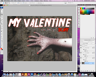
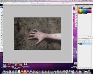
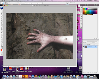
On Photoshop I have adjusted the contrast and brightness in order to make the image look darker. I also changed the hue and saturation so that the hand doesn't look 'normal'. I also used a diffuse glow option in the filter gallery because it adds an 'eery' effect to the image. Also, I used this effect on the front cover image of our main character for our magazine. This will link the two together and keep to set conventions. In our audience research the fonts were decided for our poster. The two fonts were 'friday13' and 'TX_love'. When designing the poster, we decided as a group that the 'TX_love' font was too colliqual and didn't fit the conventions of a poster. We decided on using 'friday13' for the title opposed to the tagline because it was a more scary font and stuck to the conventions of a horror film. However we still wanted to use the 'TX_love' font because it conveys the 'love' in our film. The 'love' in the film is one of the key concepts so we needed this to be evident in the poster.
When editing I made the title white because I thought it stood out and wasn't to obvious as red would be. However when developing the poster further we decided that white didn't really work so changed it to black because it is bold. However, I added a red outline in order to make it stand out.
Thursday, 17 March 2011
Film Poster
My group is in the final stages of designing with the magazine cover and poster. I am going to be working on the poster. After getting feedback from my other class members we know what type of image will reach the target audience as well as the text type and colour scheme. I have researched some posters which are similar to the ones that I will try and recreate so that it is clear what I am trying to achieve. I will us photoshop to create the poster because it has great effects which work really well such as the brightness and contrast tool which helps to make the selected image more 'ery' looking which is what we want to convey to the audience. The final image that has been decided is the image of the main characters hand. This will be used as a background with the text layered on top. In the second poster the text is surrounded by a red tint. This conveys the horror aspect because red connotes danger and blood which automatically shows the audience that the film is of the horror genre. I will try and include this on our groups poster in order to keep to the conventions of horror trailers as well as let the audience know the type of genre in a subtle way.


This is the look of poster we are going for. We don't want to give too much away but we want it to be mysterious and obviously scary. We want the audience to automatically be able to identify what genre film it is from the first look. We used the idea of the hand in our poster because it adds a sense of mystery and makes the audience what to know whos hand it is, what the story is ect. We think it is a good idea to add mystery to the poster so that when the audience go to the cinema to watch the film they are already intrigued and worried therefore they already have a sense of fear which the film will hopefully build.
Monday, 14 March 2011
Original Images
For the poster we decided to use an image of the main character's arm creeping across a tree. We decided upon this image as it was an effective part of filming that we had done when filming our trailer. We conducting research for the poster we used a screen shot clip of the hand on the tree just to test out what it looked like an if it worked well. After receiving audience feedback which was positive on this idea we decided it worked well and went ahead with the idea. We went back to the area that this particular clip was shot and re-took photos so that we could use a clear image. We also took the photograph in different positions such as going horizontal and diagonal as well as having the hand still in one shot and 'crawling' in another. We decided on the third image above as the final image because we thought that it conveyed the message we are trying to portray to the audience which is someone subtly creeping back into the life of her former boyfriend.


Trailer developments
We decided in our group that we are going to use flashing captions saying 'Love lasts forever' which evolves into 'nothing lasts forever'. We decided on this because we saw it on an existing trailer we viewed in class and thought it looked effective and worked well. I took screenshots of an example that I made to try and show what we aim to produce. We saw this effect in an existing trailer and thought it was effected because it adds mystery and makes the reader question what will happen.


This however didn't work out on Imovie as we couldn't create the effect we aimed for. We then decided to add to separate captions instead. We decided to convert this to two separate captions in order to symbolize the divide between love and death in the trailer.
Development ideas for the magazine cover...


Last lesson, my group decided to make a 'mock' magazine cover to try and convey our thoughts. It is difficult to explain exactly what we were aiming for, so by creating a hand made version of the cover we were able to show what we hope to achieve. We left blank the places that the images of the main character would go. My group also included captions that would feature on the front cover of the magazine. These included '5 Top valentines gifts' which convey the 'valentines' theme that we want. It also relates to the target audience because it is quite 'chatty' and 'colloquial' which will fit the age range we hope to attract. We decided that we wanted the magazine to be a pull out magazine consisting of a 'good' cover and an 'evil' cover. The 'good' cover links to the main character of the film, Isa and how she was at the beginning of the film which is 'normal' and 'good'. However the second cover will be 'twisted' and 'dark' in order to convey how Isa is as the film progresses. This will symbolize Isa's significant change and how she has gone from good to bad. We also decided on having half a heart on each front cover and when you pull out the second cover the hearts will connect. We want the 'good' cover to look like a 'normal' teen magazine like 'Company' and 'Cosmopolitan' so that it will reach our target audience as well as convey the 'good' side. We wanted to base the 'evil' cover on magazines such as 'Empire and 'V'.
Subscribe to:
Posts (Atom)